Arbor advises HR and finance leaders at midsize employers on long-term healthcare benefits strategy. Not a generic provider, a strategy partner. The brand had to read like a firm you'd trust with a multi-year plan.
The voice: strategic, calm, protective, executive. The job: turn rising-cost anxiety into a sense of clarity and control, warm enough to feel human, rigorous enough to satisfy a CFO.
A deep-navy foundation anchors everything; soft teal leads, with living green and lavender accents over a warm-cream ground for breathing room. Rounded "canopy" shapes and a tree-and-figure mark keep it human.
A strict grid and Inter across six weights keep it disciplined: data-confident charts, generous whitespace, and a steady, reassuring rhythm from the pitch deck to the business card.
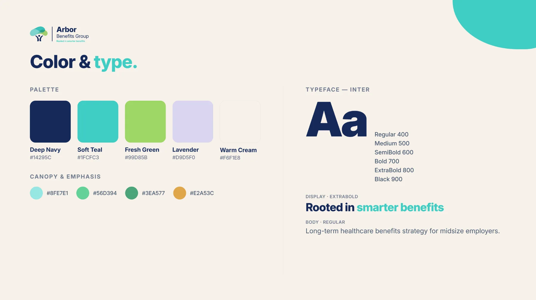
The core palette pairs a protective Deep Navy with a fresh Soft Teal lead, balanced by living green, calm lavender, and a warm-cream ground, set in Inter for a clean, modern, executive voice.

#14295C#1FCFC3#99D85B#D9D5F0#F6F1E8Display set in ExtraBold for confident headlines; body in Regular for calm, legible strategy copy.
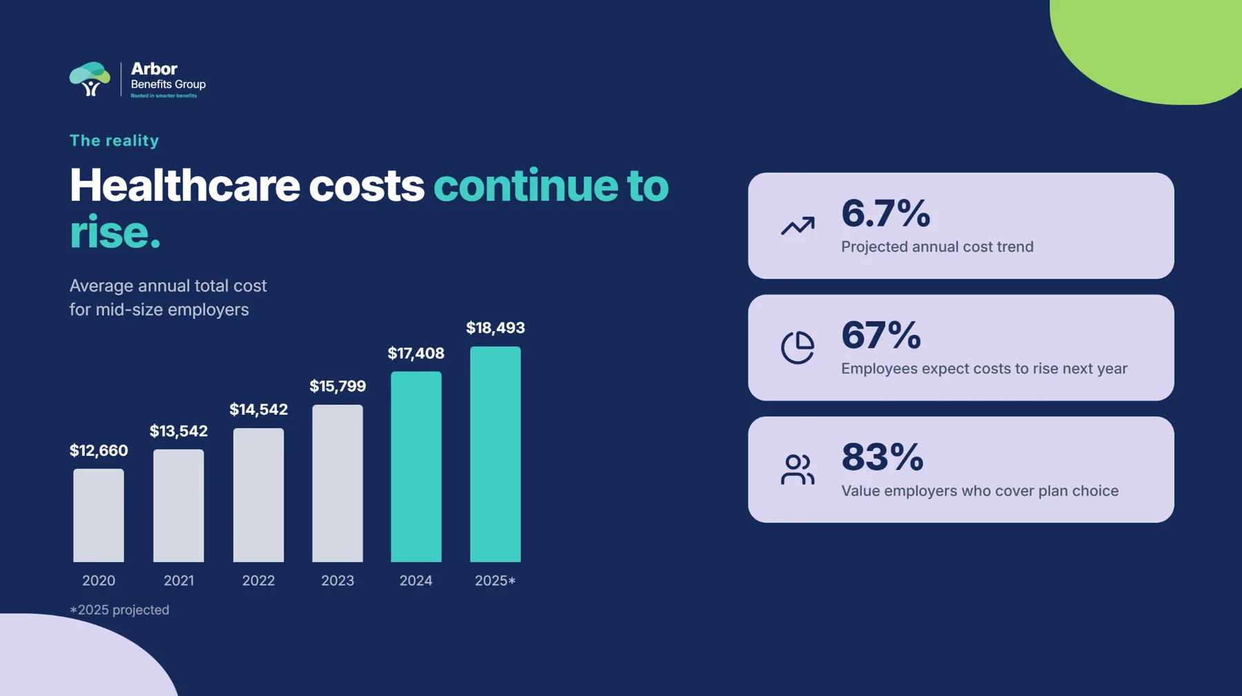
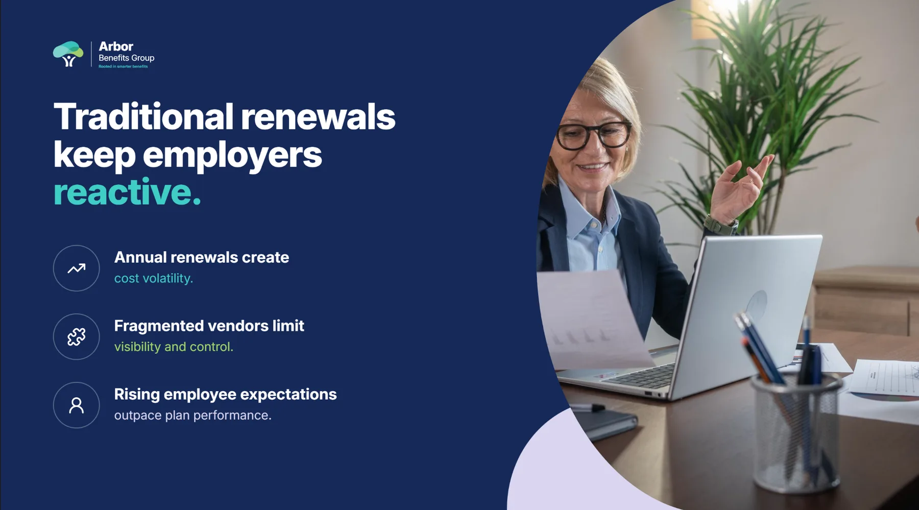
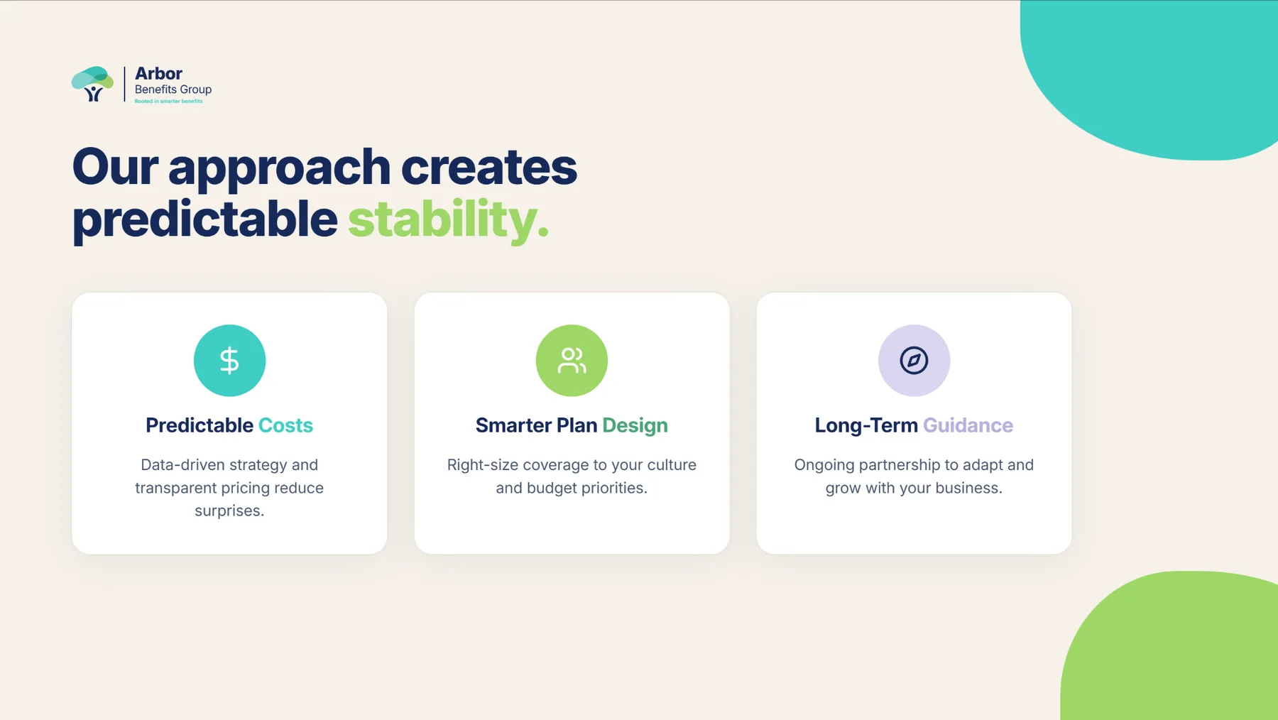
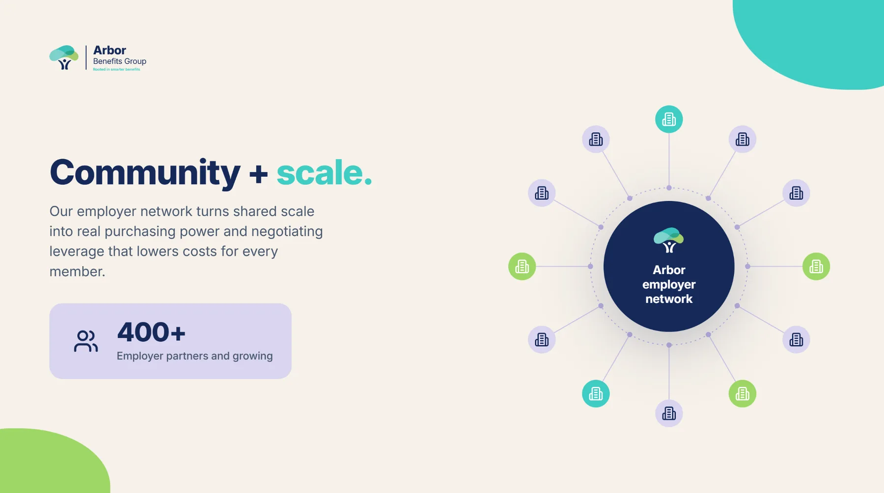
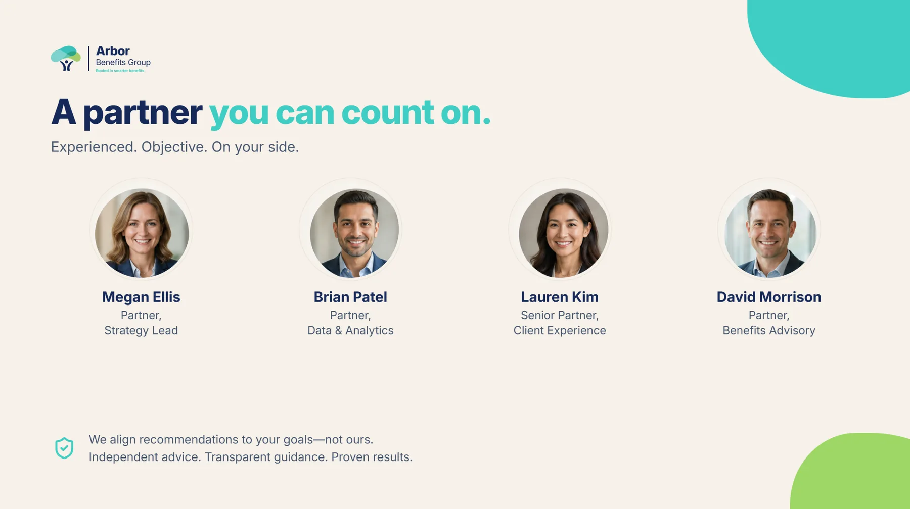
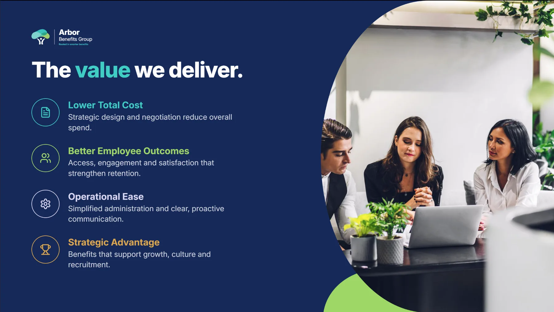
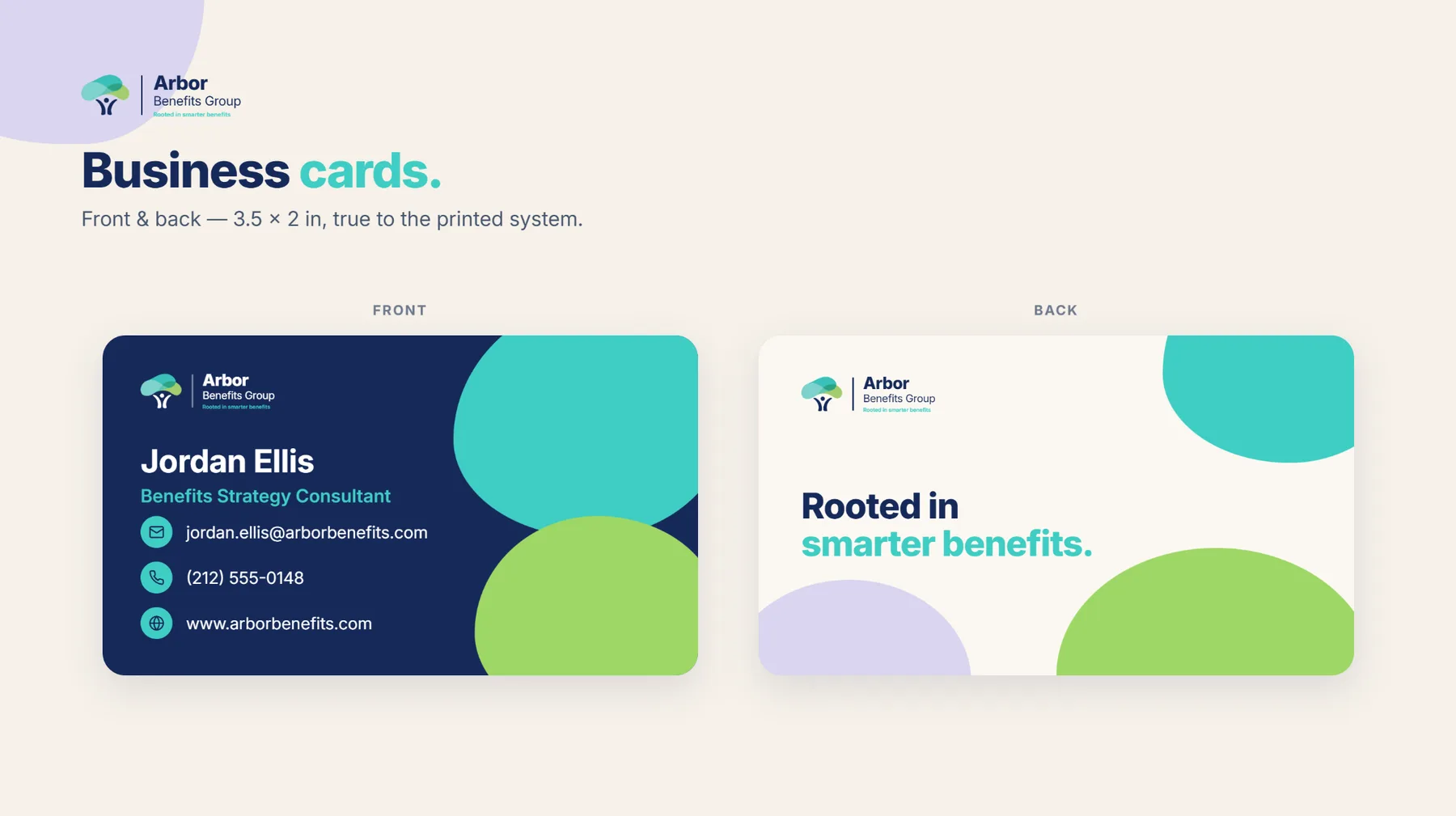
A pitch deck and stationery carry the language end to end (cost-trend data, the employer-network story, the team, and the value framework), each page calm, confident, and unmistakably Arbor.

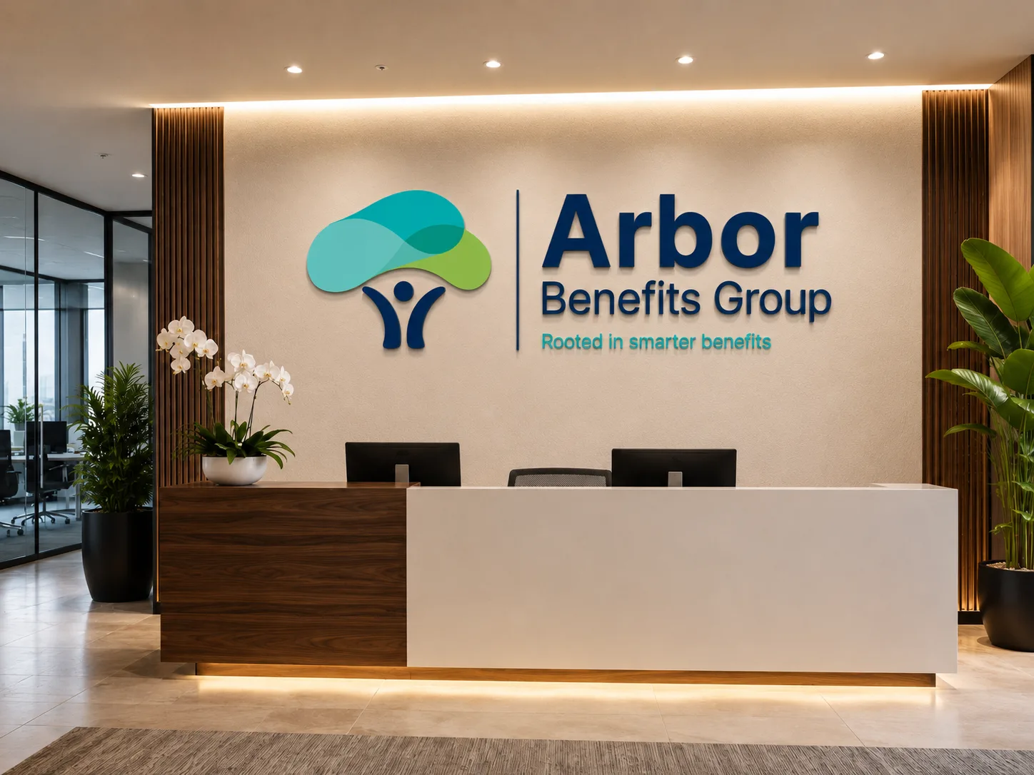
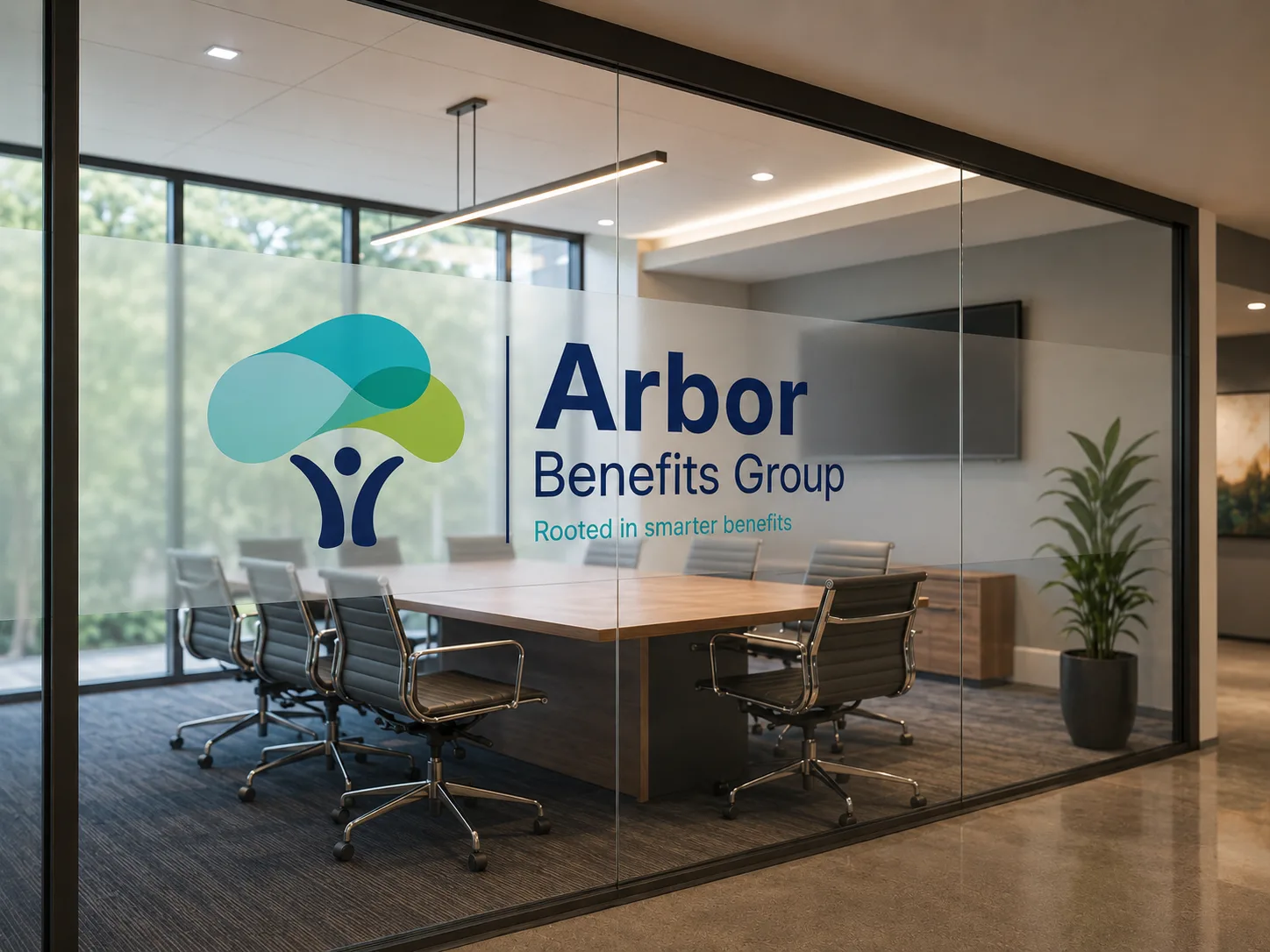
The identity carries off-screen: dimensional signage at reception and etched glass on the boardroom, calm, premium, and unmistakably Arbor.